November so far is about how Rhazes feels to use: every page is laid out the same way, and works properly on a phone.
One layout for every page
Spaces, patients, workflows, templates, PDF forms and coding standards each used to have a layout of their own, so you had to relearn where things were on each page. They now share one.
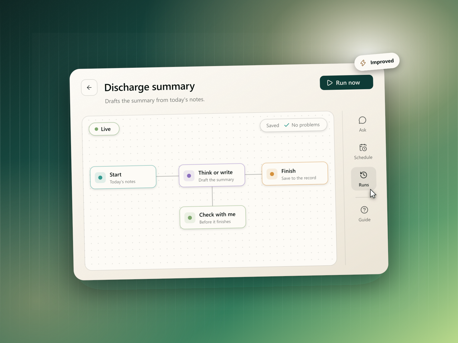
The header has back, the name, one main action and a menu, like Use patient, Run now or Fill out this form.
A tool rail on the right. Each page's tools sit on the right, with a label under each, like Files, Outputs, Tasks and Sessions on a patient. Each tool opens a side panel that slides in beside your work, one at a time.
A dock on your phone. On a phone, back and the menu sit in the top bar, and the tools and main action float in a dock at the bottom. When a page has room, its menu actions join the dock and the rail, so you're not opening menus for one item.
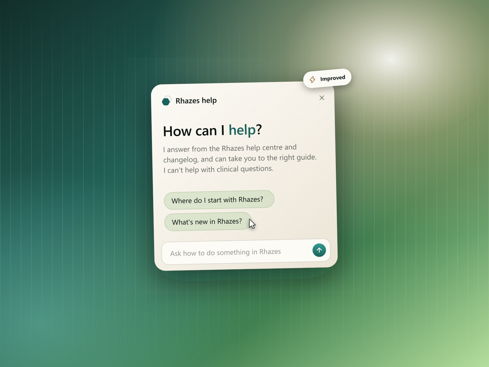
Help for the page you're on. Every page has a Guide tool with help articles picked for what you're doing.
Workflows
- Live, Paused or Draft. A workflow's status sits on its canvas and says what it means: Live workflows run, follow their schedule and appear in chats. Paused ones keep your edits but don't run.
- Run now always works. If a workflow isn't live, the button reads Go live and run.
- Ask Rhazes shows its work first. When you ask for a change, you see what Rhazes looked up and the steps it built before its reply. Questions with several answers now have a clear Continue button.
- The run page highlights when a run needs your answer, in its tools and on your phone's dock.
The message box
- Lighter and quicker. The message box starts as one line and grows as you type.
- Sources beside Transcribe. Choose space and Choose sites sit next to Transcribe, so they're in reach without a separate bar.
- Feature guides on your terms. Hide the guides under the message box, and bring them back from the same place.
Settings on your phone
- A settings home. On a phone, Settings opens on your profile card and every page grouped into Account, Preferences and Connections, each showing what it's set to.
- Native-feeling pages. Each settings page uses grouped lists and slides in like your phone's own settings.
Spaces, patients and coding standards
- Spaces show file previews, and their web sources and members open in a side panel.
- Patients. The sessions list says what each consultation was about, and files can be deleted from their row.
- Coding standards have their own page. The file panel checks how Rhazes read your list: which columns it took, how many codes it found, and any duplicates or codes with no meaning, with one click to see them.
Fixes & polish
- Every empty list and panel now looks the same and says what fills it.
- The sidebar shows your weekly credits as a meter.
- The Pro offer during setup is clearer about what Pro changes.
- Country flags show properly on Windows.
- Your language choice is shared between the website and the app.
- Smoother motion across the message box, panels and settings.